
La Fin Du Monde Brand Refresh
Brief: This project was a brand refresh for a Canadian beer, La Fin Du Monde, to target new demographics.
Multiple mechanical’s were physically made from the measurements of the original box and recreated in Adobe Illustrator. Then I took the necessary elements of the original packaging and redesigned it to better represent what La Fin Du Monde really means, “the end of the world” while making a unique and easy to recognize refreshed package.
Using Adobe Firefly to create backgrounds for photos I took of my final design letting you put your product in any scene.
This is the printed box before it was cut out and folded (not to scale).
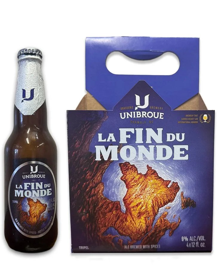
The original packaging for La Fin Du Monde.
Here is a good look at the bottle label with a fun torn away element.