
Screen-printing
Brief: Create a six color abstract print and use clear core for increase transparency and opaque to reduce transparency.
“Chapel” is a six screen abstract print. I learned how layering inks changed the way they interact and explored that further by adding opacity or transparency.
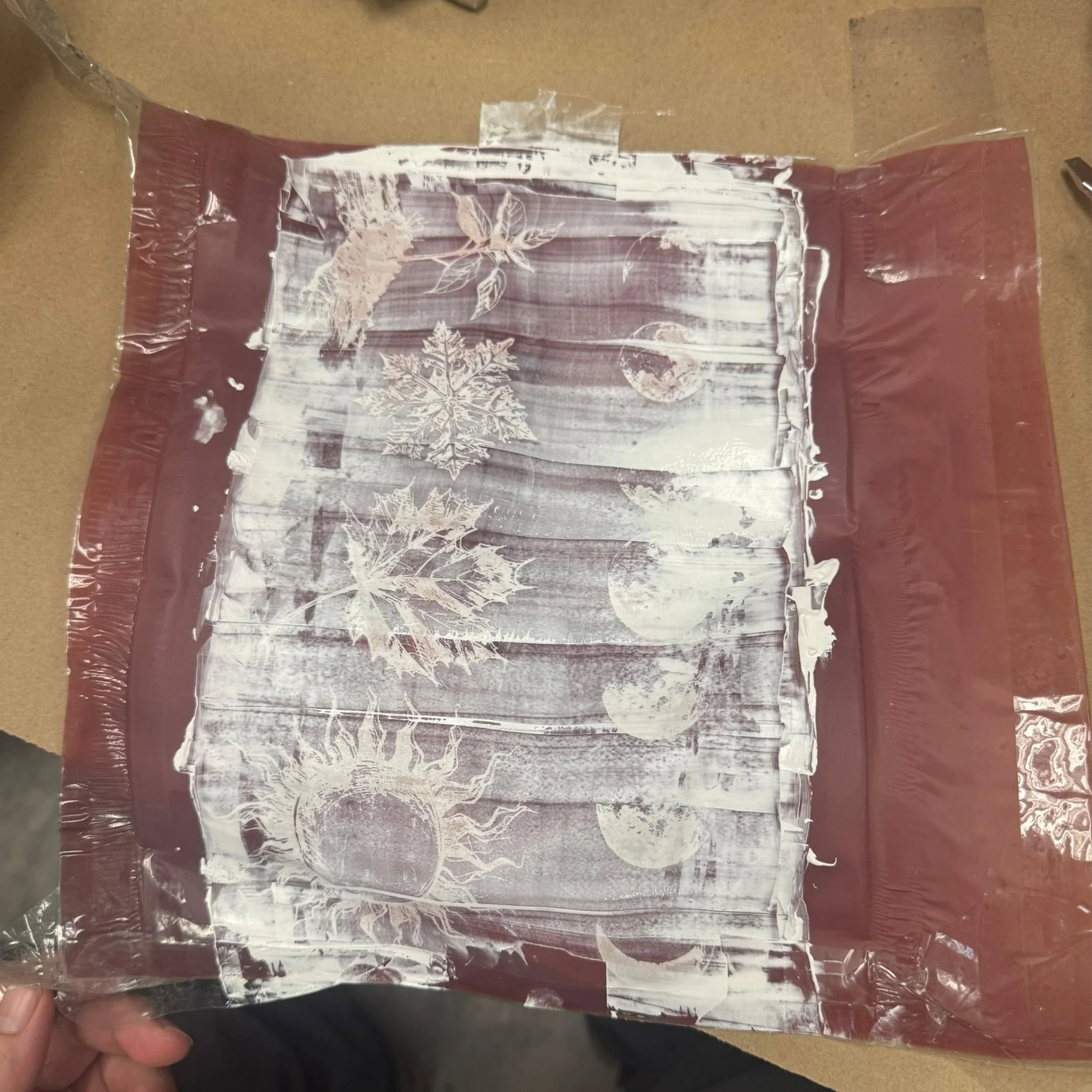
The aftermath of a failed attempt at printing on three inch PVC pipe I chose for my non-traditional printing assignment, “learn the hard way” could be my middle name.
Brief: Using a white under-base and three other colors, use overprinting and trapping to cover the white layer.
The ferryman from Greek mythology “Charon” was a four screen print with three obvious colors, grey, brown, and pale green but there is a white under-base that allows the ink to show up on the black paper.
Brief: Create a 3 color design based on the theme the class agreed on, The theme was spooky food. Use trapping to contain colors and avoid paper showing between colors.
This spooky snack taught me the importance of trapping your layers of ink and getting your registration perfect.